
CASE STUDY
Somerville, MA
Website Redesign & Branding
Somerville’s current website isn’t leveraging basic design principles that could make it much more appealing and useful to its citizens. For this design project, I tried my hand at designing them a new one!


Main nav & branding
- Brand: Somerville doesn’t currently seem to have a brand identity.
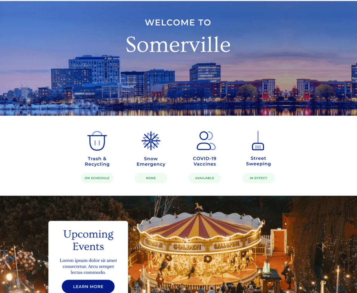
- I went with a rich shade of blue because blue is associated with trust and wisdom.
- The fonts used are Ovo for headers, Libre Baskerville for serif body font, and Montserrat for san serif. All three fonts have a wide, stable stature and generous, curving shapes. I felt that these attributes express the city’s wish to be both stable, friendly, and flourishing.
- Simplicity: The main nav was much too crowded. I put most items in a hamburger menu. The best practice here would be to use Google Analytics to determine which pages are being visited the most, and keep those ones in the main nav.
Accessibility: Accessibility should always be a prime consideration in website design. I kept language choices and other accessibility options in the top right, clearly visible, for that reason. I also kept search centrally-located, because I’m assuming that it’s a commonly-used feature on the site. Again, Analytics should be used to determine which parts of the website are being used the most, and which parts of the website the website owner/entity most wants to draw attention to. The homepage can then point especially to these parts of the website.

Hierarchy, imagery, white space, and icons
- Hierarchy: on the current Somerville website, hierarchy is unclear. This layout has a clear hierarchy: #1 welcome, #2 the most commonly-used parts of the website, and #3 upcoming events. #1 gives you a sense of peace and having arrived. #2 immediately addresses pressing pain points you may have. #3 shifts from the practical to the playful.
- Imagery: Implemented large, striking images to engage the viewer and give them positive feelings. Imagery should convey possibility and enjoyment.
- White space: Implemented greater “white space” (both literal white space and photography).
- Icons: These icons are more rounded, artistic, and modern than the icons currently being used. Colors have been customized to be the “Somerville colors.”

More hierarchy and icons
- Hierarchy: After the events banner, we’re back to the practical. In this layout, I’m shifting the user’s attention between user-centric parts of the website and Somerville-centric parts of the website. This allows the user to feel like they are being heard and known, while also allowing the city to guide people toward the information it wants to share. This is how hierarchy can be used to accommodate multiple stakeholders’ needs: by alternating sections, I keep both the user’s needs and the website’s goals in mind, and neither trumps the other in the hierarchy.
- Icons: In her unmissable book Joyful, Ingrid Fetell Lee identifies rounded shapes as one of the 10 aesthetics of joy. In this case, the “tone” of the icons is actually especially helpful: when people are looking up this kind of information, they’re often stressed. There’s a bill they have to pay, a complaint they have to file, a parking ticket they want to dispute. Since their state may be tending toward chaotic, overwhelmed, and aggressive, the rounded shapes exactly contradict that by being calm, spacious, and soothing.

Hierarchy yet again
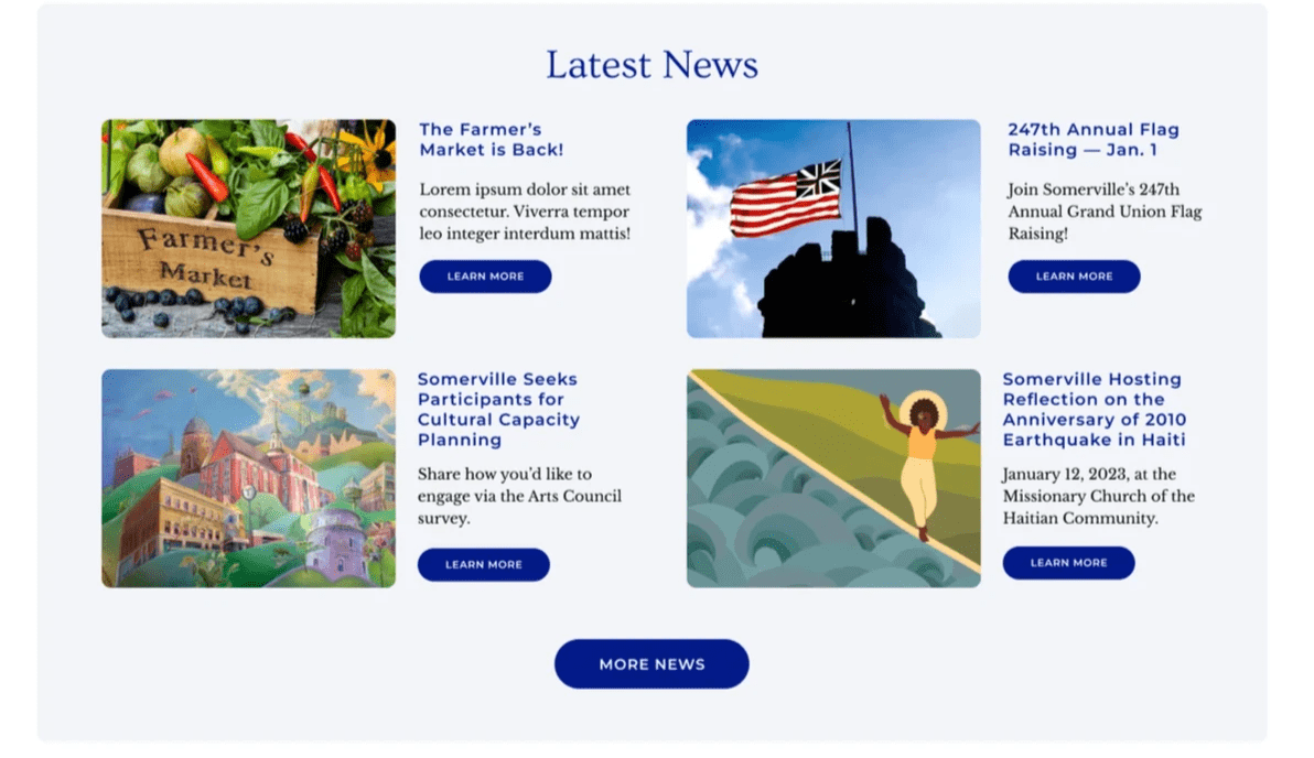
We switch back again to the more city-centric content. Somerville’s current website has a news section, but by not including snippets along with the article title, they’re missing an opportunity to engage the user.

A spotlight on the wins
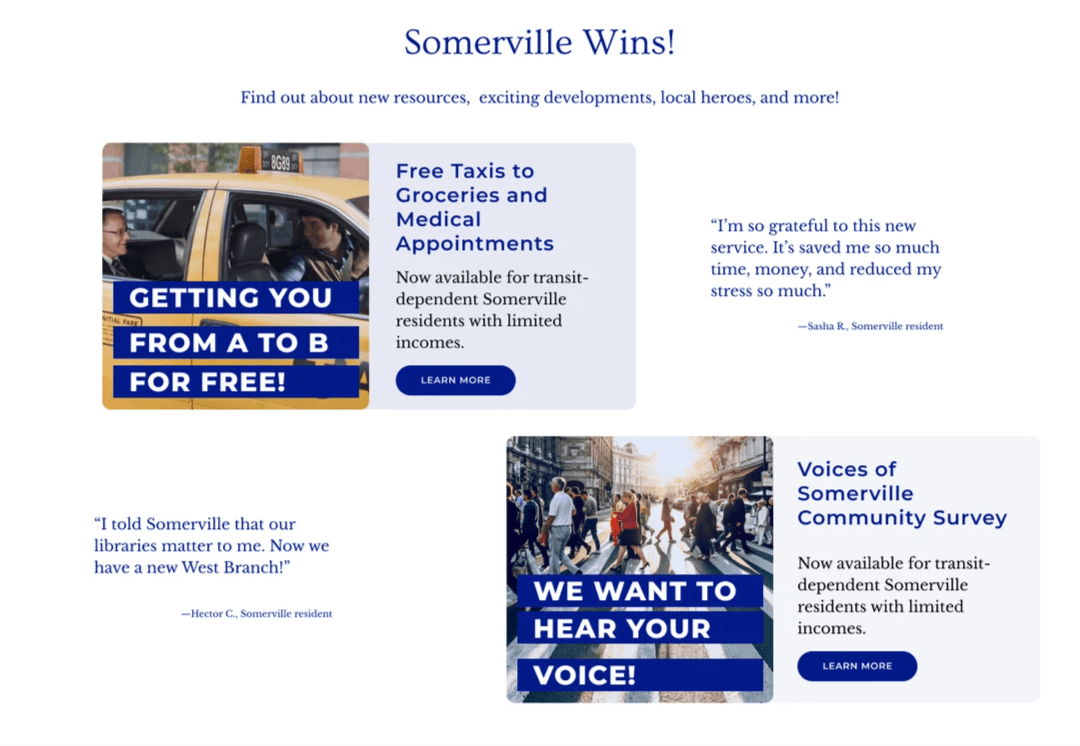
This is an entirely new idea that I came up with. I imagine that it would benefit Somerville if its citizens were more aware of the successes and wins going on in the city every day. This section would be for good news of all kinds, from new services to local heroes.

Meet your new mayor
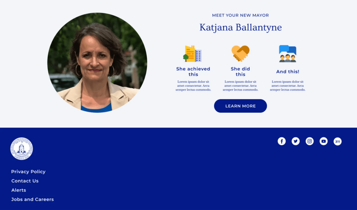
When I started this design, Ballantyne was a relatively new mayor. So as a way to engage the community, I thought it would be nice to “introduce” her. I imagine the “learn more” button would link to essentially a short photo essay about the mayor.
In conclusion
This is one of my favorite projects I’ve worked on. As a resident of Somerville for more than 10 years, I loved having the opportunity to think about my city in this way.
Skills used: UI • UX • Branding • Copywriting • Marketing • Community Engagement Strategy • Nonprofit Strategy


